Make plots
This document describes how you can make plots using xolotl. Here, we assume you have a single compartment model set up as follows:
x = xolotl.examples.neurons.BurstingNeuron;
Plot voltage/Calcium
Using the plot function
The plot function will generate a figure, simulate the model, and plot the
voltage traces. Here are a few important features to note:
- If a figure handle is set up in
x.handles.figit will use it. Otherwise, it will generate the plot and put the figure handle there. - Subplot handles are stores in
x.handles.ax. - The plots are colored by the largest contributing current. You can turn this
functionality off by setting
x.pref.plot_color = false. To make this change permanent for all xolotl objects, edit thepref.mfile in the xolotl directory. - The plots also show the calcium trace (if any). To turn this functionality off,
set
x.pref.show_Ca = false. To make this change permanent for all xolotl objects, edit thepref.mfile in the xolotl directory.
What's a contributing current?
The voltage trace is colored by the dominant current at that time. When the voltage is increasing, the color corresponds to the largest positive (inward cation or outward anion) current. Inversely, when the voltage is decreasing, the color corresponds to the largest negative (outward cation or inward anion) current.
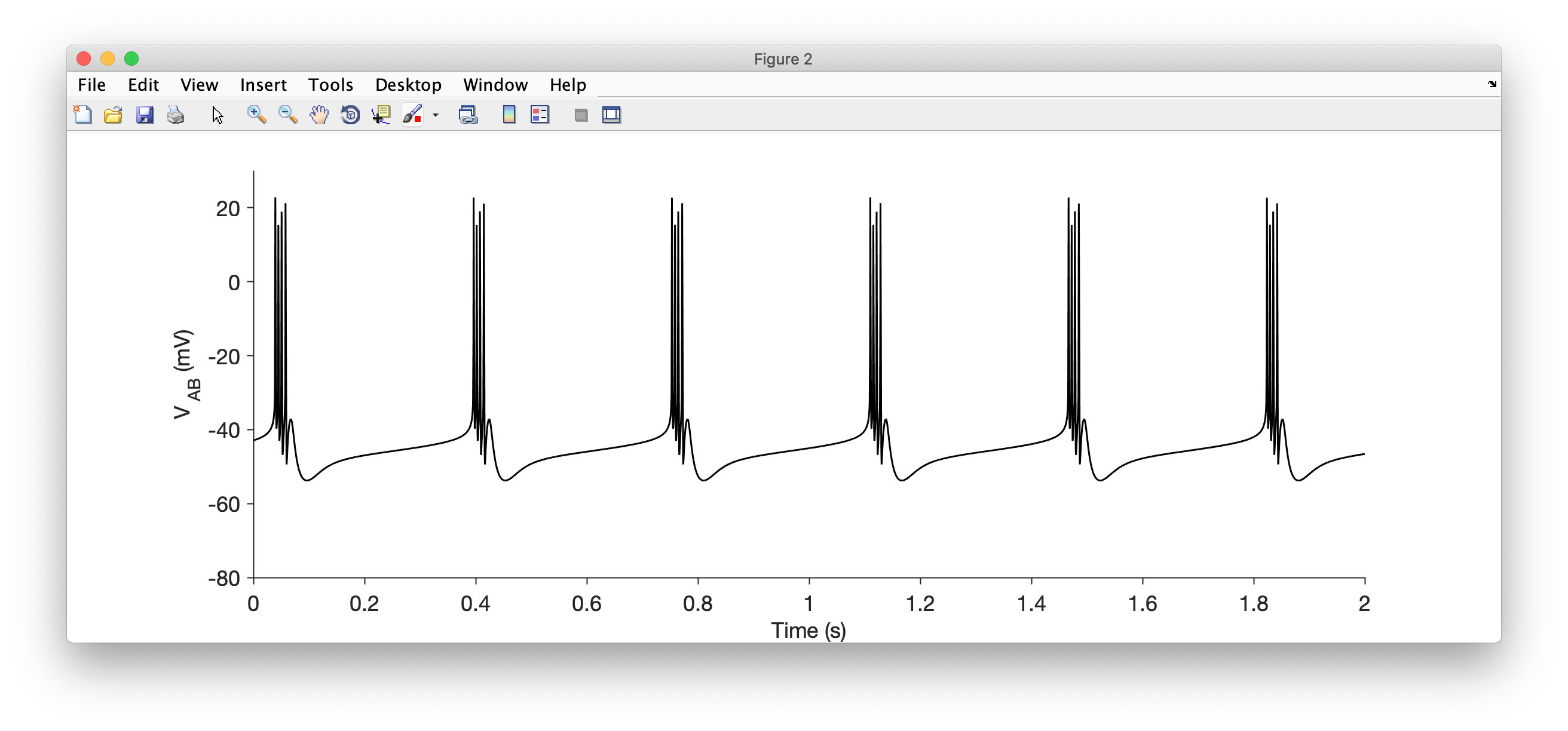
For example,
x.plot
makes this figure:
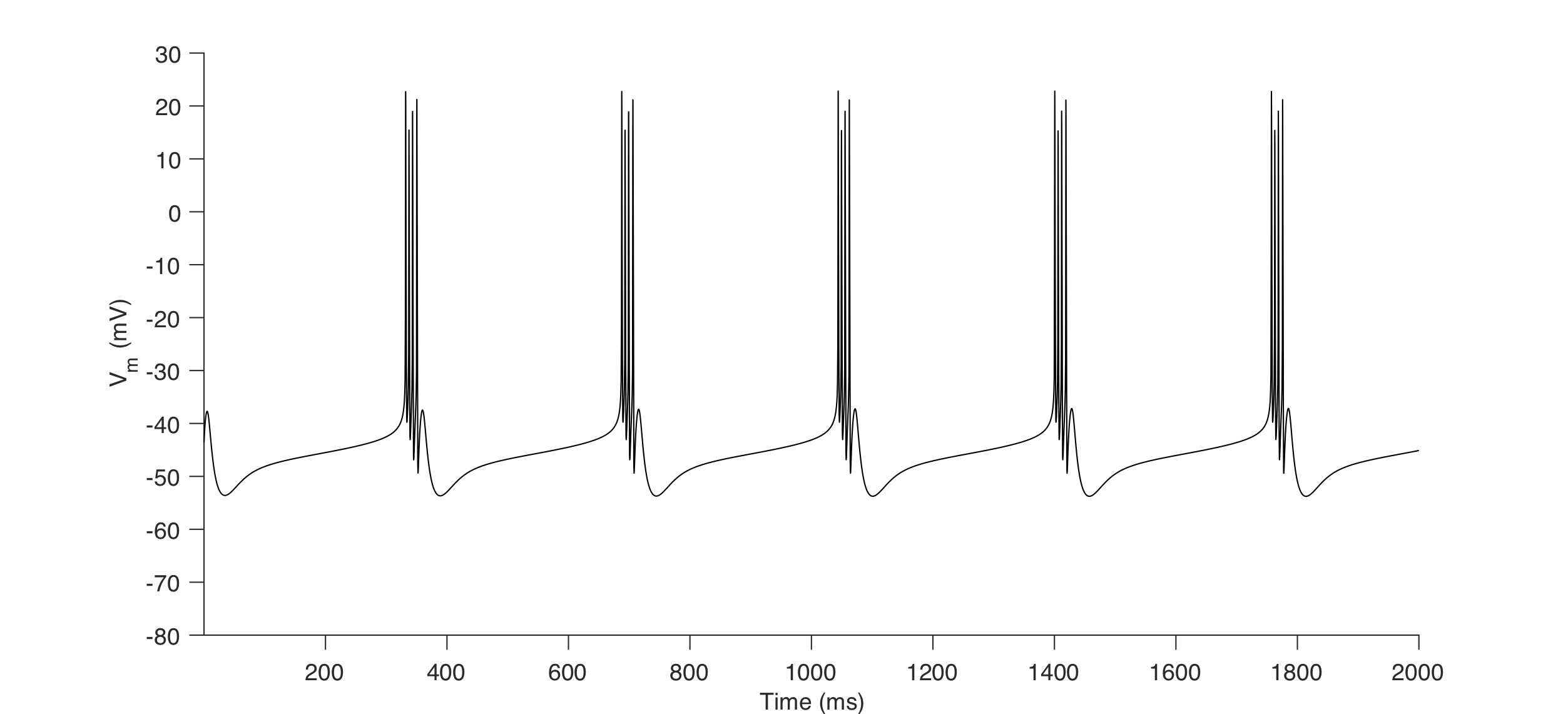
By directly integrating the model
Since the outputs from x.integrate are matrices when x.output_structure = 0, you can plot them as you would any other matrix of vector in MATLAB.
For example,
V = x.integrate;
time = x.dt:x.dt:x.t_end;
plot(time,V,'k')
xlabel('Time (ms)')
ylabel('V_m (mV)')
makes this figure:
Plot Currents
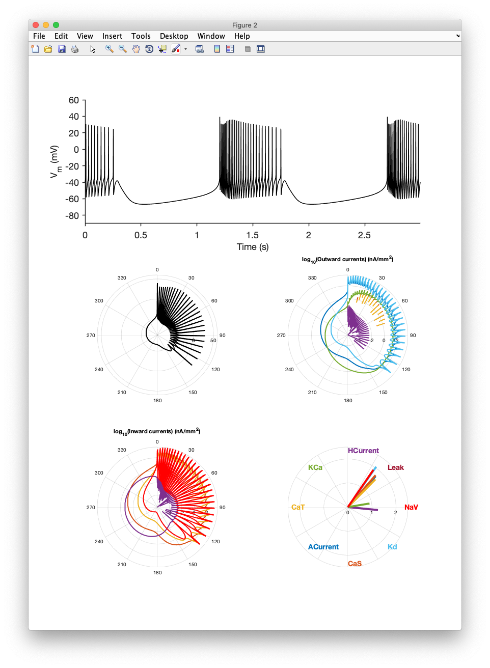
Using the porcupine function
All inward and outward currents in a periodically bursting neuron can be visualized using this function. For example,
x.porcupine()
makes this figure:
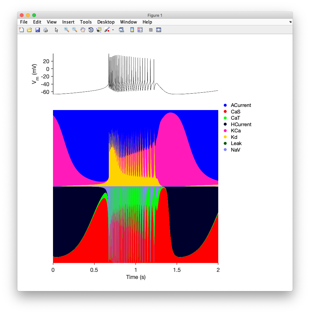
Using the currentscape function
The contributions of each current (or "currentscape") can be visualized using the currentscape function. For example,
x.currentscape
makes this figure:
Manually
You can always simply integrate the model and pull out every current directly. For example:
[~,~,~,I] = x.integrate;
returns a matrix of all currents that you can plot.
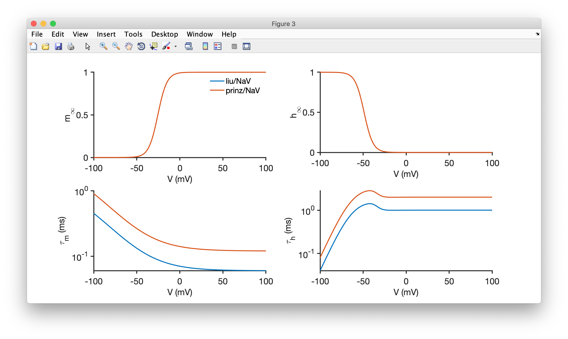
Show activation curves and timescales of channels and synapses
The activation curves and timescale dependence on any channel or synapse can be plotted using the show method.
For example,
x = xolotl;
x.show('liu/NaV','Liu')
x.show('prinz/NaV','Prinz')
makes this figure:
x.show can also work with conductance objects directly. This is useful if you are working with a conductance object with custom runtime-defined parameters.
x = xolotl.examples.neurons.BurstingNeuron;
x.show(x.AB.NaV)
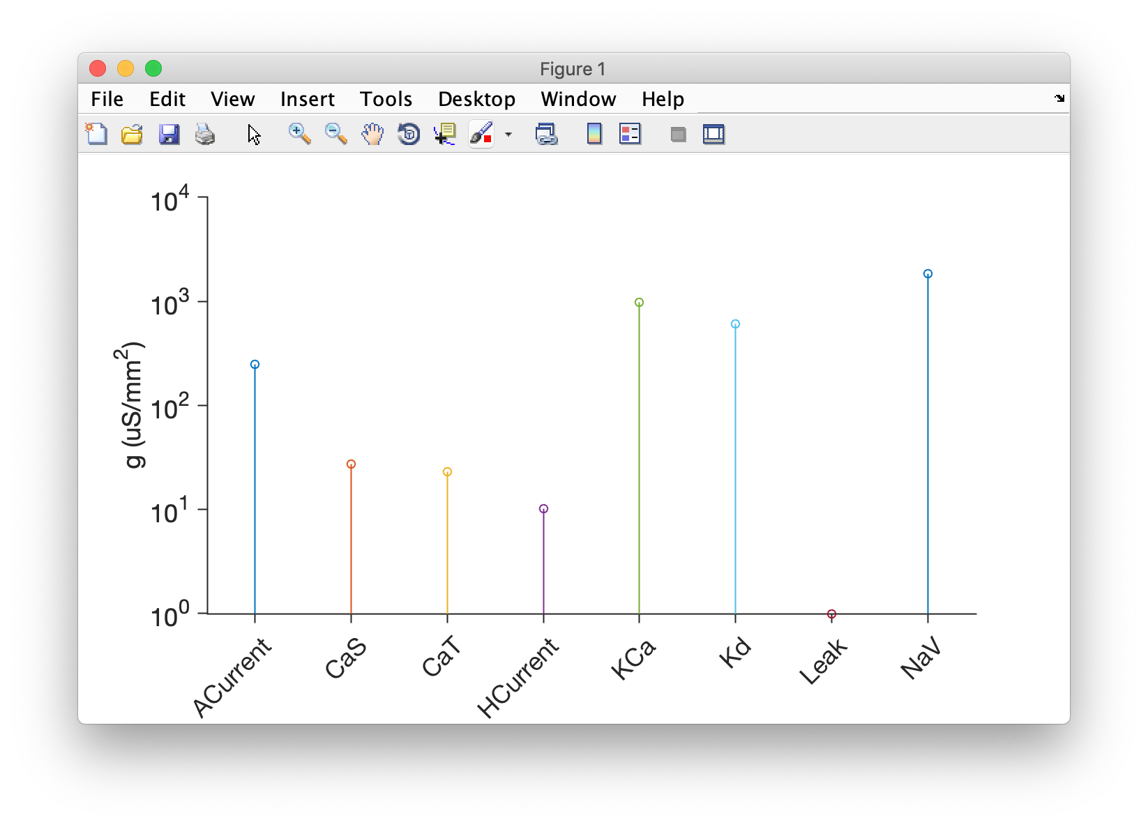
Make a stem plot of maximal conductances in a compartment
xolotl comes with a built in method to plot the maximal conductances in a compartment. This can be useful for more complex visualizations that you could make yourself.
For example,
x = xolotl.examples.neurons.BurstingNeuron;
x.plotgbars('AB');
makes a plot like this: